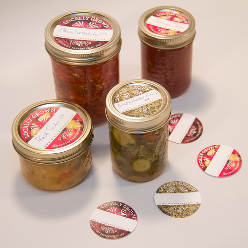
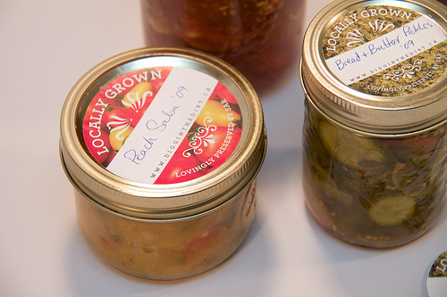
I meant to post about these back in November, when my colleague at work, graphic designer Matt Webb designed them for me. I paid him in pickles.

He used my own photography as the background and I had him make two sizes, one to fit the standard-sized jars and the other to fit the wide mouth. Aren’t they fabulous?
I’m not using them on every jar, just ones I want to give away, to fancy them up. I have some nifty water-soluble labels that dissolve quickly with water that I picked up from Lee Valley that work very well for home labeling. They just don’t look fancy enough for giving away.

They look great!
Any chance you’ll make the templates or documents available for download?
Probably not, no; I don’t have the original files and well, I kinda want to keep them to myself! Thanks for visiting!
love these! I may totally rip off the concept of using photography for my labels – I usually use clip art, but the photographs of the porduce are spectacular.